
If you talk to anyone under the age of, say, 50, I don’t think you’d get much of an argument that Australian house prices are completely out of control, and that Gen X’ers, millennials, and zoomers (the poor bastards) have gotten a pretty raw deal when it comes to home ownership.
Many boomers, at least as the stereotype goes, would counter that this is just sour grapes – that house prices aren’t really all that much more expensive after accounting for inflation, that they paid much more in loan interest, and that they didn’t get any subsidies like the first homeowner’s grant we have today.
Who is right? Well, let’s sit back with a slice of our favourite artisanal sourdough smothered in avocado, look at the data and try to figure it out.
First, lets go back to the early 1970’s. This was the earliest I could find reliable data from the ABS. Here’s what houses cost in the capital cities:
You can watch this all the way to the present day if you want, but the numbers will look artificially low because they don’t account for inflation – see a little further down the page for an inflation adjusted version.
Here’s what a house cost in each of the capital cities (except Darwin – sorry guys, blame the ABS) in 1973:
You can see that a dollar back in the day went a lot further – around 11 times further according to the RBA’s inflation calculator, in fact. Check out this Woolies catalogue from 1973:
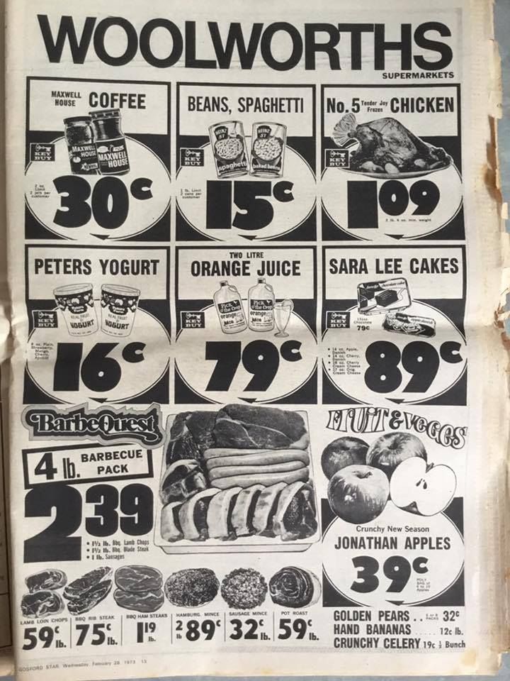
Remember the good old days when you could buy a whole chicken for $1.09? Yeah, me neither.
The average adult wage back then was around $4100 in 1970, or about $48,000 after we run it through the RBA’s inflation calculator. The below image is from the ABS (PDF warning):
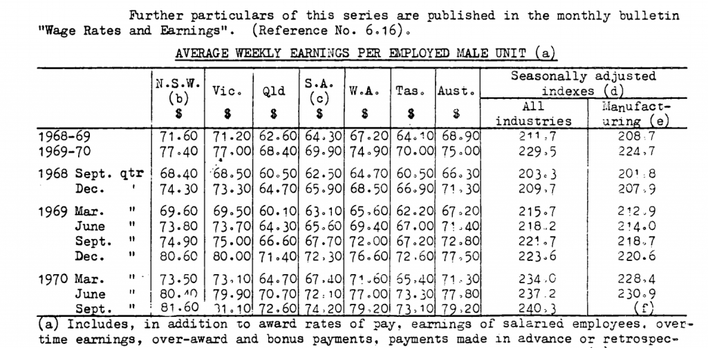
We can see the average ‘male unit’ (lol) earned $79.20 per week (around $900 in 2020 adjusted dollars) pre-tax back then.
Just for reference, the total Australian population back then was around 12.5m, pretty much bang on half of what it is today. Interestingly, not all cities have grown at the same rate, as you can see from the following chart:
Although Sydney and Melbourne are clearly in their own league in absolute terms, Brisbane, Perth, and Canberra are growing much more quickly – the latter two cities tripling in size since 1970. Melbourne has roughly doubled. Sydney and Adelaide are actually the laggards, with about 70% population growth over the last 50 years. This chart might illustrate things better:
Anyway, back to our house prices. The racing bar chart below is the same as the first one I posted above, but this time it accounts for inflation – i.e. all dollar amounts have been converted into 2020 dollars using the RBA’s inflation calculator (P.S: Darwin people, your time has come… you’ll appear around 1986):
In 2020, the average house in Sydney costs north of $1.1m. If you had a time machine and could go back to 1970, that same amount of money could buy you 5.2 houses in inflation adjusted dollars. The below animated line chart shows how this ratio has changed over time:
As you can see from the chart, for the price of an average house in Sydney today (and after accounting for inflation) you could have bought 5.2 houses in 1970, 3.8 houses in 1980, 3 houses in 1990, 2.5 houses in 2000, and 1.6 houses in 2010. The trend is similar in other cities.
But what if we leave inflation aside and look at house prices as they relate to income? As we mentioned above, the average adult wage back then was around $4100 in 1970, and the average Sydney house cost $18,700. That would mean an income to house price ratio of about 4.5 – in other words, it would take 4.5 times the average pre-tax annual income to buy the average Sydney house.
The above chart shows that a house in Sydney has ballooned to 12.2 times annual income. Again we see similar, though less pronounced, trends in other cities.
There are a couple of caveats to keep in mind with this data, however.
- The income amounts I’m using are medians, not averages. This means that, while the ratios should be indicative of most of us ‘middle class’ types, they might be pretty inaccurate for the lowest and highest paid earners.
- The salary data is Australia wide and doesn’t account for differences between cities or states. This might, for example, make the ratios in Sydney seem artificially high and the ratios in Hobart seem artificially low.
- The data are for individuals, not households. In the 1970’s, single breadwinner households were a lot more common than they are today.
On this last point, I did manage to find some interesting data from the ABS, though it only goes back to 1978:
What’s interesting to note from this chart (aside from the arguably sexist colours I decided to use) is that, while it’s certainly true that female employment has increased by nearly 50% (39.8% in 1978 vs. 57.1% in 2018), male employment has decreased by about 10% in the same period (75% in 1978 vs. 67% in 2018). It’s therefore overly simplistic to state that household incomes have ‘doubled’ since women have entered the workforce, and that this accounts for increased house prices.
Finally, we need to look at how interest rates have changed over the last 50 years.
The above chart shows average lending rates on owner-occupier home loans. I know, I know – the 3.65% showing in 2020 seems way too high, but this is the RBA’s own data (see for yourself) and I didn’t want to tamper with it or try to cherry-pick. Perhaps 3.65% is the average comparison rate people are currently paying, unfortunately the RBA data doesn’t make things 100% clear.
Anyway, with this data we can now plot out the average cost of servicing a mortgage – both the principal and interest payments – over the last 50 years:
Here’s a non-animated version that might be a little easier to read:
It’s interesting to note that, although in all cases things are significantly less affordable than they were in 1970, in most cases we’re not actually at peak un-affordability when it comes to servicing a mortgage. Although house prices in all cities are at or near historical highs, interest rates are at all time lows. For Sydney, peak mortgage pain came in 1990 when average home loan rates peaked at about 17% and you were paying $4400 / month in 2020 dollars towards your mortgage.
So with all the above in mind, what can we actually infer from the data? I think it’s fairly safe to make a few pronouncements.
- In inflation adjusted dollars, house prices are at or near all time highs. In 1970, an average house in Sydney cost around 20% of what an average house costs today. In other words, the ~$1.1m sale price of an average Sydney house today would buy you roughly 5.2 houses back in 1970. The trend is similar, though often not as significant, in all capital cities.
- The trend is similar if we look at average annual income as a proportion of average house prices. In 1970, the average Sydney house cost 4.5 times average pre-tax income. In 2020 it was 12.2 pre-tax income.
- Even though house prices are at or near all time highs, in pretty much all cities, mortgage payments are NOT at record highs. The reason is that interest rates are unprecedentedly low. If house prices continue to grow, or interest rates go up again, mortgage payments are likely to become unsustainable, particularly in Sydney.
- Population growth doesn’t seem to account for the increase. For example, Sydney’s population has grown by 70% in the last 50 years and its average house price has increased by 520% after accounting for inflation. Perth, on the other hand, has seen a population growth of roughly 300%, but its house prices have only increased by 260%.
A few other considerations that I didn’t have time to investigate:
- As far as I can tell, there isn’t any data going back to the 1970’s that shows household income. Having said that, it’s reasonable to infer that household income has increased significantly, both because wages have typically outpaced inflation, and because there are a lot more women in the workforce.
- Average house and land size, as well as the quality of furnishings have probably changed over time. Again, I couldn’t find any data tracking this.
- The first home owner grant has only been around for 20 years and theoretically makes housing more affordable for new entrants to the market. Having said that, it’s a fairly inconsequential amount as a proportion of average home prices.
So anyway, there you have it. It’s probably not going to come as a surprise to anyone that house prices have gone up significantly over the last 50 years. What I did find interesting is that, assuming you have enough money for a deposit and you can get a competitive interest rate (as opposed to the 3.65% figure I used in my charts), servicing a mortgage is in all cases easier today than it was in 1990. Here’s the same chart above, but with a 2020 interest rate of 2.7%:
As we can see from the updated chart, none of the cities are currently at peak un-affordability, at least based on servicing a mortgage. Sydney was there in 1990 (avg. loan rate 17%), Melbourne in 2011 (avg. loan rate 7.04%), and the other capitals in 2008 (avg. loan rate 8.84%).
Let’s hope interest rates stay at record lows – with today’s house prices, it’ll only take a relatively modest increase in interest rates for mortgage payments to become completely crippling. Just for fun, the final chart below shows what monthly mortgage repayments would be if interest rates went back to the their 1970 peak of 17%:
I hope you enjoyed this Australian house price retrospective. Even though I’m a jaded millennial living in Sydney who feels like he may have missed the boat on homeownership, I wanted to be as objective as possible and tried not to go into this project with any pre-conceptions.
It should also be noted that I’m not an economist or mathematician, I’m just a guy who enjoys data visualisation doing this part time, so mistakes are entirely possible.
If you did like this and want to help me out, there are a few things you can do.
- I just created a Twitter account (I know, I know – bit late to the party). I promise to only post interesting things! Follow me here: https://twitter.com/LeaneJonathan
- If you have a spare couple of bucks, please consider joining my Patreon. I’d love to do this as a full time job, but at the moment I’d even settle for breaking even! I’ve just set my Patreon up here: https://www.patreon.com/datamentary
- You could subscribe to my Youtube channel here: https://www.youtube.com/channel/UCiqE7AFojsc6U7fqmPt2Vdg
Youtube won’t let me monetise until I hit 2000 subscribers, so there’s still a looong way to go 🙂 - You could upvote this post on Reddit, share it on FB, etc… Really, any publicity I can get at this point would be a big help.
- And finally, if you have any requests for future topics or would like to collaborate on something, please leave a comment here and I’ll get in touch.
2 replies on “Australian house prices over the last 50 years: A retrospective”
Thanks for this analysis Jonathan. Very interesting and great visualisations.
Re your comment:
“The first home owner grant has only been around for 20 years and theoretically makes housing more affordable for new entrants to the market.”
The Commonwealth Department of Housing and Construction ran the First Home Owner Scheme in the mid-1980’s. There have been variants of it floating around since then, all of them – as you say – immaterial given the cost of Australian metropolitan housing.
See you on twitter.
Thanks for the correction Dean! Had no idea it went back that long.