Categories
Money

213 options and 61 Billion dollars under management: A brief history of ETFs in Australia

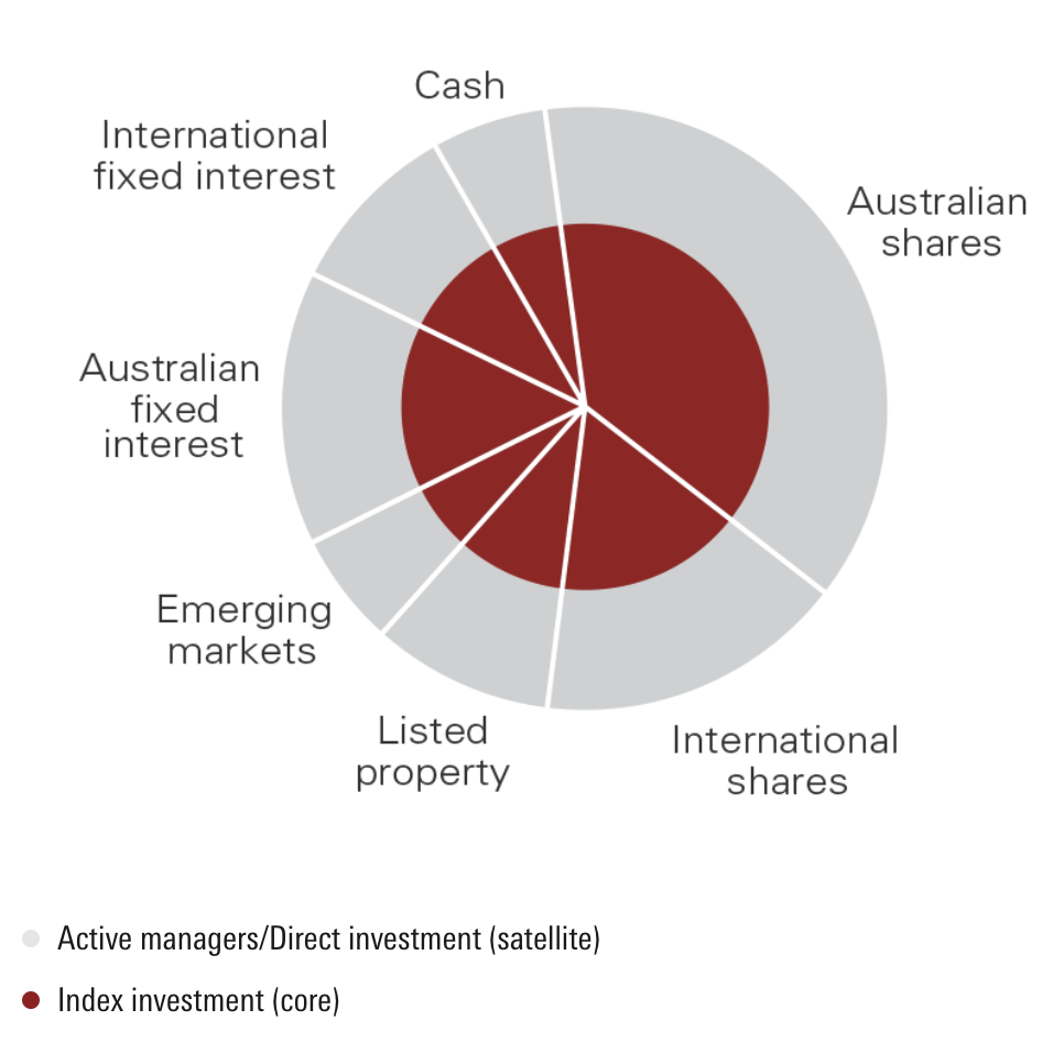
I like having an occasional tipple on individual shares, but the bulk of my portfolio is in ETFs. Turns out this is a fairly common method of investing known as the ‘core-satellite approach’ – it’s even got its own Wikipedia page.

The core-satellite approach visualised. The red ‘core’ comprises of stable, relatively low risk ETF’s. Source: Vanguard

But I might be getting ahead of myself a little. For those that don’t know, ETFs are Exchange Traded Funds, also commonly known as ‘index funds’ (though the two are actually slightly different things). The name may sound intimidating, but the concept is actually incredibly simple.

Imagine that, when you buy a share in an ETF, you’re not buying just a single share, but rather a bundle or container of other shares. For example, one very popular ETF listed on the ASX is VAS, which stands for the ‘Vanguard Australian Shares Index ETF’. VAS holds the largest 300 companies listed on the ASX (known as the ‘ASX300’) pro-rated to their size, which as we discovered from my ‘How big is the ASX‘ article, accounts for 91% of its total market cap.

In other words, when you buy a share in VAS, you are not really just investing in a single share, but rather an entire index – in this case, the ASX300.

ETFs are popular because, although the performance of individual stocks can be volatile, entire indexes tend to perform fairly consistently – especially over longer periods of time. For example, the Dow Jones, which is an index that comprises the 30 largest US companies, has averaged a 7.4% annual return over the last ~130 years:

With an ETF, you are typically spreading your risk over dozens to hundreds of companies, so if any one company fails or even just underperforms, your downside is limited.

ETFs also frequently rebalance, which is just a fancy way of saying that as individual companies increase or decrease in value, the ETF will buy or sell them as necessary to keep accurately tracking its index. So to go back to VAS as an example – if Company A’s value decreases enough that it falls out of the ASX300 and company B’s value increases enough that it enters the ASX300, VAS would sell its shares in Company A and buy shares in Company B.

Not only are ETFs much less risky than investing in individual shares, they also tend to outperform managed funds after accounting for fees:

ETF’s tend to outperform managed funds, especially after taking fees into account. Source is IFA.

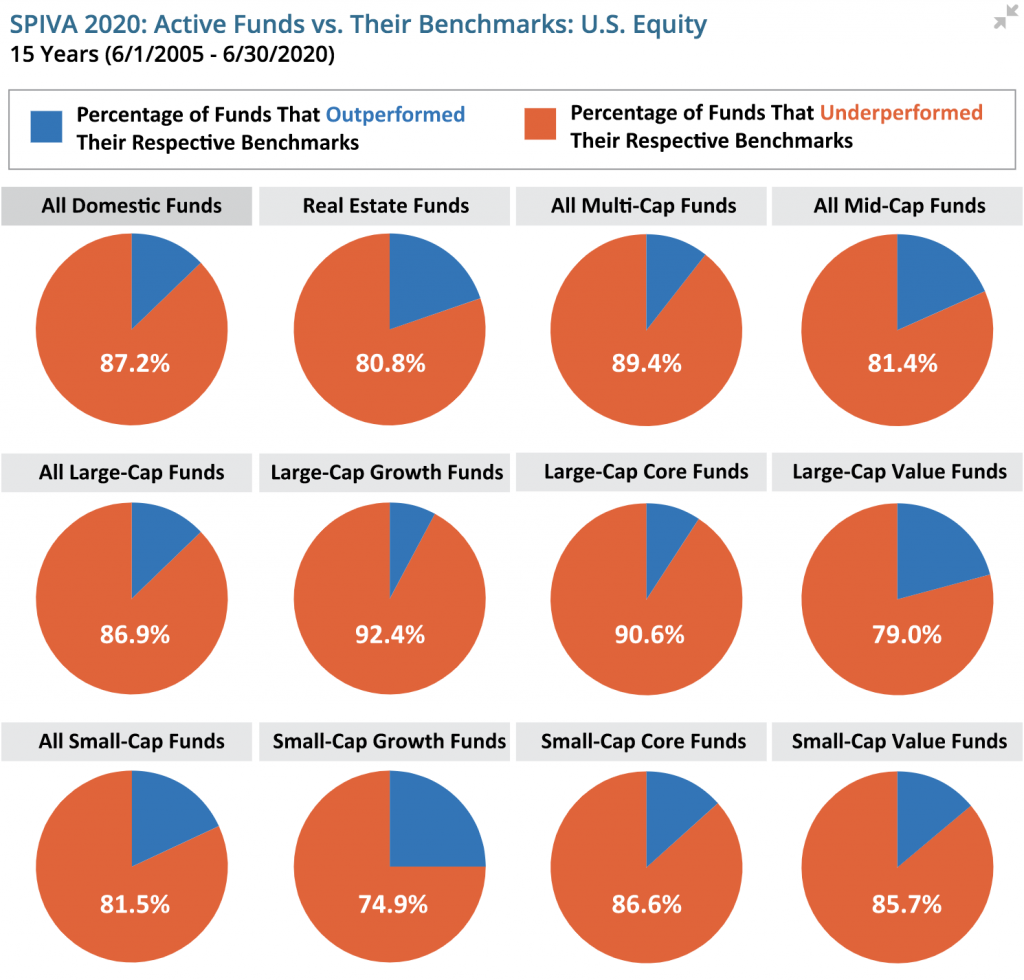
As the chart above shows, most of the ‘professionals’, i.e. active fund managers, aren’t able to outperform the index over extended periods of time.

The set and forget approach, low fees, and relatively high performance of ETFs have led to an explosion in so called ‘passive investing’ over the last couple of decades, as this chart from Morningstar shows:

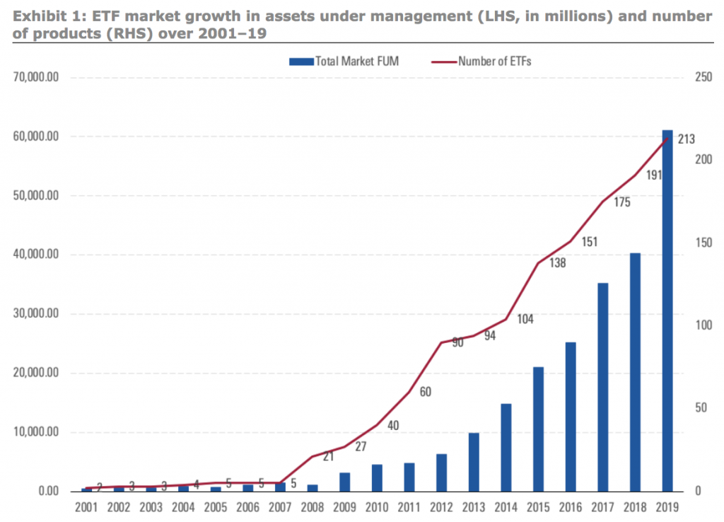
The blue bars show total funds under management, which rose 20-fold in the last 20 years, from 3 billion AUD to over 60 billion AUD. The even bigger increase, however, has been in the number of ETFs available on the ASX, which increased 100-f0ld over a similar period, from just 2 in 2001 to over 200 in 2019.

Ironically, this has led to a paradox of choice with ETFs. Now, instead of painstakingly agonising over which shares you should buy, you can painstakingly agonise over which mix of ETFs you should buy.

From humble beginnings and fairly vanilla offerings like the aforementioned VAS that tracks the ASX300, you can now buy ASX listed ETFs for all sorts of things, like HACK (which ‘provides simple and transparent exposure to the leading companies in the global cybersecurity sector’), ROBO (‘designed to measure the performance of robotics-related and/or automation-related companies’), and BBOZ (which ‘aims to help investors profit from, or protect against, a declining Australian share market’).

Below is a racing bar chart showing the growth of $1000 invested into a selection of 11 different ASX listed ETFs from November 2017 until November 2020 (excluding inflation and dividends). In addition to VAS, HACK, BBOZ, and ROBO, the other 9 are:

  • VDHG ‘provides invests mainly into growth assets, and is designed for investors with a high tolerance for risk who are seeking long-term capital growth.’
  • VGS ‘provides exposure to approximately 1,500 large-cap and mid-cap companies listed on the exchanges of the world’s major economies excluding Australia.’
  • VGE ‘provides exposure to approximately 22 emerging market countries across Asia, Latin America, Europe, Africa and the Middle East.’
  • MOAT ‘gives investors exposure to a diversified portfolio of attractively priced US companies with sustainable competitive advantages according to Morningstar’s equity research team.’
  • TECH ‘comprises of 25 to 50 global technology companies across areas such as software, semi-conductors, data processing, computer equipment and databases.’
  • VAE ‘provides low-cost exposure to securities listed in Asia excluding Japan, Australia and New Zealand.’
  • DRUG ‘provides simple, cost-effective and transparent exposure to the largest companies in the global healthcare sector.’
  • PMGOLD ‘is a right to gold created by The Perth Mint, which gives investors the ability to purchase Government-backed gold via the Australian Securities Exchange (ASX).’

What can we learn from the above chart? Primarily that there are now so many ETFs tracking so many different things that choosing between them isn’t all that different from choosing between individual shares, which – as we’ve already established – isn’t all that much different from gambling, even if you’re a ‘professional investor’.

Nothing in this post should be construed as financial advice, but speaking personally, I’ll be treating a lot of these newer, more exotic ETFs as if they were single shares and weighting them in my core-satellite approach accordingly. The O.G. ETFs, i.e. the ones that have the longest track records, are based around a large index (or series of indexes) like the ASX, DJIA, NASDAQ, and so on.

ETFs that attempt to track a specific industry (like ROBO) or have a strong albeit indirect active manager component (like MOAT) are very enticing and have certainly had a good run over the last 3 years as the chart above shows, but in a sense, they’re antithetical to what made ETFs so popular to begin with: a passive set and forget approach with low fees and relatively diversified risk.

In short, buying ETFs and ‘taking a punt’ are no longer necessarily mutually exclusive.

If you enjoyed this article and would like to help me out, there are a few things you can do.

  1. I just created a Twitter account (I know, I know – bit late to the party). I promise to only post interesting things! Follow me here: https://twitter.com/LeaneJonathan
  2. If you have a spare couple of bucks, please consider joining my Patreon. As I said, I’d love to do this as a full time job, but at the moment I’d even settle for breaking even! I’ve set my Patreon up here: https://www.patreon.com/datamentary
  3. You could subscribe to my Youtube channel here: https://www.youtube.com/channel/UCiqE7AFojsc6U7fqmPt2Vdg
    Youtube won’t let me monetise until I hit 2000 subscribers, so there’s still a looong way to go.
  4. You could upvote this post on Reddit, share it on FB, etc… Really, any publicity I can get at this point would be a big help.
  5. And finally, if you have any requests for future topics or would like to collaborate on something, please leave a comment here and I’ll get in touch.
Categories
Politics

How economically dependent is Australia on China (and vice versa)?

2020 has been a pretty bad year for Australian exports to China. The most recent tariffs on wine follow similar sanctions on barley, beef and lamb, cotton, timber, coal, and even lobsters… The ABC has a full rundown.

Officially, none of this is politically motivated – China would be in breach of WTO rules if it was – so there are totally legitimate reasons for the sanctions, like ‘quarantine delays’ (lobsters), ‘bark beetles’ (timber), ‘contaminated meat’ (beef and lamb), and ‘anti-competitive behaviour’ (wine and barley).

Yep, totally 100% legitimate non political grievances – it definitely doesn’t have anything to do with Australia backing a global inquiry into the origins of the coronavirus in April or banning Huawei from the roll-out of 5G over “unfounded” national security concerns. It’s also purely coincidental timing that 9News alleges they recently received a shit list of 14 separate grievances from the Chinese Government that would need to be redressed before relations could be normalised.

So how screwed would we be if this economic sabre rattling turned into a full blown economic war?

Well, lets start with a bit of history. This racing bar chart shows a month by month breakdown of our biggest export markets since 1988:

If you don’t feel like watching the whole thing, you can use the little chart section to skip around. As you can see, Japan holds the top spot until early 2009, at which point China roars ahead to become our biggest customer. By October 2020 (the most recent ABS statistics), China buys more of our stuff than the next 9 countries combined.

In fact, including Hong Kong, China accounts for around 43% of our total merchandise exports:

So what do we actually sell to China, anyway? Well, lots of stuff, as it turns out – though (surprise, surprise) mostly stuff that we dig out of the ground:

As you can see from the above chart (data from 2018 and in US dollars), something like 80% of our exports to China are ‘Mineral Products’. Iron ore alone accounts for 44% of our total exports, with coal coming in a distant (but far from inconsequential) second.

Recall from above that coal was one of the items on the sanction list, along with barley, beef and lamb, cotton, timber, and lobsters.

Could Iron Ore be next? Well, it’s probably unlikely. China needs huge quantities of iron ore for steel production, mostly for its domestic market. In 2019, the entire global output of steel production was 1869.9 million tons, of which China produced 53% or 996.3 million tons – that’s nearly 10 times what they produced in 2000 as the chart below shows:

And here’s the state of the global iron ore market, as of 2019:

As you can see, Australia is by far the largest producer of iron ore, with an output of 930 million tons in 2019, or a little over 37% of the world’s total output. Brazil comes in a fairly distant second, with 480 million tons or 19% of the world output, though in 2020 production is expected to be down due to Covid-19 related issues and dam collapses.

China is desperately trying to diversify away from Australian iron ore (we currently provide about 60% of their iron ore, with Brazil coming in next at just 20%) by developing mines and infrastructure in Africa, The Guardian reports, but these sources aren’t expected to come online for between 5 and 10 years.

In the short term, we’re really the only game in town, so for the time being iron ore exports are probably safe. But, like any good business, we should be working hard to diversify both our customer base and our products while times are good.

Having a single customer making up nearly 50% of our revenues is a dangerous position to be in, and (as pretty much every Aussie will admit) we rely far too much on digging wealth out of the ground – the Harvard Atlas of Economic Complexity ranks Australia a dismal 87th of 133 countries, down 32 spots since 1995.

If you enjoyed this article and would like to help me out, there are a few things you can do.

  1. I just created a Twitter account (I know, I know – bit late to the party). I promise to only post interesting things! Follow me here: https://twitter.com/LeaneJonathan
  2. If you have a spare couple of bucks, please consider joining my Patreon. As I said, I’d love to do this as a full time job, but at the moment I’d even settle for breaking even! I’ve set my Patreon up here: https://www.patreon.com/datamentary
  3. You could subscribe to my Youtube channel here: https://www.youtube.com/channel/UCiqE7AFojsc6U7fqmPt2Vdg
    Youtube won’t let me monetise until I hit 2000 subscribers, so there’s still a looong way to go.
  4. You could upvote this post on Reddit, share it on FB, etc… Really, any publicity I can get at this point would be a big help.
  5. And finally, if you have any requests for future topics or would like to collaborate on something, please leave a comment here and I’ll get in touch.
Categories
Money

How we might end up accidentally pricing ourselves out of the property market

Turns out there’s about 3.1 trillion dollars collectively sitting in our super funds at the moment – that’s an average of $124,000 for each man, woman, and child in Australia. Of course, this money isn’t evenly distributed – the median is closer to $65,000 for males and $45,000 for females, though this increases to $183,000 and $118,600 respectively when you look at just the 55-64 age bracket:

Since 3.1 trillion is firmly in the ‘so much money it’s completely bonkers insane’ territory, here’s an amusing chart that’ll hopefully give you a little context. All numbers have been converted into AUD.

Nice to know that we could buy the world’s largest oil producer and nearly have enough left for a manned mission to Mars, eh?

The crazy thing is that superannuation is just getting started, as the table below shows:

That’s right, in 2040 we’re expected to have a collective $10.5 trillion in our super funds.

By 2060, it’s estimated that 70% of Aussies will be retiring with at least $250,000 in super, and 40% will have at least $500,000 (both figures are after accounting for inflation).

Proportion of superannuation balance ranges at retirement (2019 dollars, AWE deflated) – source: Treasury.gov.au

What’s interesting to note is that the vast majority of that money has to go somewhere before people reach retirement and start drawing it down; only a relatively small portion of it ‘sits in the bank’ – the rest of it is invested. Here’s a breakdown of how these funds are currently allocated:

Why is this important? Well, when you’re talking about investing amounts in the trillions of dollars, you start to move markets – even really big ones.

Take, for example, the arguably already overpriced Australian housing market, which as of September 2020 has a collective value of around 7.3 trillion dollars (source). What happens when hundreds of billions of super fund dollars flow into this market over the next 20 years looking for a return? Yeah, you guessed it – house prices go up. Again. Great if you’re already a home owner looking for those sweet sweet capital gains, but a real kick in the balls/ovaries if you’re not.

It’s partly for this reason that Norway’s sovereign wealth fund (the largest in the world with about 1.5 trillion AUD under management) isn’t allowed to invest within Norway itself – it would absolutely swamp the economy, and price Norwegian people out of their own markets.

As far as problems go, ‘having too much money’ is probably fairly low on most people’s lists, but it’s a problem nonetheless. Cashed up super funds that pile into the property market will make it even harder for Aussies to get a foot in the door, and will indirectly mean that much of the burden of funding retirees will fall on younger working Australians – which is exactly what compulsory superannuation was supposed to stop from happening.

If you enjoyed this article and would like to help me out, there are a few things you can do.

  1. I just created a Twitter account (I know, I know – bit late to the party). I promise to only post interesting things! Follow me here: https://twitter.com/LeaneJonathan
  2. If you have a spare couple of bucks, please consider joining my Patreon. As I said, I’d love to do this as a full time job, but at the moment I’d even settle for breaking even! I’ve set my Patreon up here: https://www.patreon.com/datamentary
  3. You could subscribe to my Youtube channel here: https://www.youtube.com/channel/UCiqE7AFojsc6U7fqmPt2Vdg
    Youtube won’t let me monetise until I hit 2000 subscribers, so there’s still a looong way to go.
  4. You could upvote this post on Reddit, share it on FB, etc… Really, any publicity I can get at this point would be a big help.
  5. And finally, if you have any requests for future topics or would like to collaborate on something, please leave a comment here and I’ll get in touch.
Categories
Money

How do the States & Territories compare economically?

Australia is rich. Like, really, really, rich. Despite being only the 55th largest nation in terms of population, we’re the 13th largest in terms of total economic output, and the 10th largest on an income per capita basis (based on 2020 IMF data – source).

This probably doesn’t come as a shock. Despite having an entirely justifiable whinge about house prices, most of us know we have relatively cushy lives, particularly in comparison to many of our Asian and Pacific neighbours. Australia is known as the ‘lucky country’, after all.

Funnily enough though (and quite apropos to this article), the term ‘lucky country’ (first popularised in a book of the same name by an Australian author, Donald Home, back in the 1960’s) was actually supposed to be negative:

“Among other things, it has been used in reference to Australia’s natural resources, weather, history, its early dependency of the British system, distance from problems elsewhere in the world, and other sorts of supposed prosperity.” (from Wikipedia)

‘The Lucky Country’ – not actually supposed to be a good thing…

So how do the States & Territories of Australia compare – both with each other, and on a global stage? Well, to paraphrase George Orwell’s Animal Farm, some States and Territories are luckier than others. But before we get on to the qualitative differences, lets start with the quantitative ones.

Here’s how things look on a State and Territory basis in absolute terms – i.e. not accounting for population differences. Note the term, GSP. That’s not a spelling mistake, it stands for ‘Gross State Product’ and is meant to be a similar measure as GDP, but for sub-national units.

We can see here how much the economy of Australia is dominated by NSW and Victoria, though this is due mainly to how populous they are compared to the other States (the two of them collectively make up around 60% of the total Australian population), as the next chart shows:

What the above two charts obscure is that while the economies of the 2 biggest States are relatively closely matched, things start to diverge a lot at the smaller end of town:

The above chart shows how GSP has changed over the last 20 years. You’ll note that, although all States & Territories (which I’ll just refer to as ‘States’ moving forward) are better off than they were in 1990, there hasn’t been a huge amount of ‘social mobility’.

The poorest States in 1990, Tasmania and South Australia, are also the poorest States in 2020. The wealthiest States in 1990, the Northern Territory, WA, and the ACT, are also the wealthiest in 2020 (though WA took the lead from NT in 1993 and has mostly held it ever since).

Here’s a static version of where things are at the moment, as per the latest ABS data:

What’s pretty staggering is the size of the difference between the ‘rich’ and the ‘poor’ States – TAS and SA have roughly half the GSP per capita of WA and NT. In Global terms, that’s a bit like the difference in GDP between Switzerland (2nd highest GDP per capita) and Belgium (16th highest GDP per capita).

The following chart shows where each State’s GSP comes from, broken down by industry / sector. Make sure you play around with the filter, as the default setting will show you an Australia-wide breakdown (you might need to scroll down on the dropdown to see TAS and ACT):

The single biggest contributor to Australian GDP is Mining – no surprises there. But take a look at how different things are on a State by State basis.

In NSW and Victoria, ‘Financial and Insurance services’ are the biggest contributors to GSP. In SA and Tasmania, it’s ‘Healthcare and Social Assistance’. In the ACT it’s ‘Public Administration and Safety’ – probably due mostly to lots of politician related expenditure.

Only in Queensland, WA, and NT is Mining the biggest industry, but particularly in the latter two States, it makes up a huge proportion of total GSP.

As the above charts show, NT and WA are especially dependent on mining, with close to a full 50% of the latter’s GSP coming from that industry.

In fact, if all the minerals and metals suddenly disappeared from WA overnight, it’d wake up with a GSP per capita of around $58,700, making it even poorer than Tasmania. WA is the luckiest state in the entire lucky country, it would seem (at least while the iron ore price stays high).

As a final bit of fun, here’s where some of the States & Territories would rank if they were sovereign nations. Let’s start with WA, since there actually is a secessionist movement in Western Australia – it even has its own Wikipedia page.

As you can see from the above table, Western Australia would be ranked the 46th largest economy in the world if it was its own country, beating out New Zealand, and only around 10% smaller than Bangladesh despite having less than 1/50th the population.

Next, narrowly beating out Perth in position 42, we have Queensland:

An impressive showing, with a GDP significantly larger than Bangladesh, Egypt, and Vietnam – all of which have between 18 and 30 times as many people.

Jumping up the ranks somewhat, we have Victoria in 33rd place:

Wealthier than Ireland, Denmark, and Singapore in absolute terms, (though somewhat poorer on a per capita basis) and nearly as wealthy as the most populous nation in Africa, Nigeria.

Finally, in 25th place we have New South Wales:

An economic powerhouse, wealthier on a per capita basis than all its neighbours (including, surprisingly, Sweden).

Sorry SA, NT, ACT, and Tasmania – it’s not that I don’t love you, I just ran out of time. Cue sob story: this is my part time hobby. I’d love to make it my part time job, and maybe even some day, my full time job.

If you enjoyed this article and would like to help me out, there are a few things you can do.

  1. I just created a Twitter account (I know, I know – bit late to the party). I promise to only post interesting things! Follow me here: https://twitter.com/LeaneJonathan
  2. If you have a spare couple of bucks, please consider joining my Patreon. As I said, I’d love to do this as a full time job, but at the moment I’d even settle for breaking even! I’ve set my Patreon up here: https://www.patreon.com/datamentary
  3. You could subscribe to my Youtube channel here: https://www.youtube.com/channel/UCiqE7AFojsc6U7fqmPt2Vdg
    Youtube won’t let me monetise until I hit 2000 subscribers, so there’s still a looong way to go.
  4. You could upvote this post on Reddit, share it on FB, etc… Really, any publicity I can get at this point would be a big help.
  5. And finally, if you have any requests for future topics or would like to collaborate on something, please leave a comment here and I’ll get in touch.
Categories
Money

PSA: Tesla may soon be as big as all other automakers combined

I wasn’t really paying attention, so maybe I’m the only one that hadn’t noticed, but Tesla’s market cap as of December 9th 2020 is a touch over 616 billion US dollars. That makes it kind of a big deal. In fact, it accounts for a full third of the global automaker market cap:

Just for a bit of context – Tesla only listed on the stock market 10 years ago (June 2010). The company itself was only founded in 2003. Compare that to Ford which launched in 1903 and basically invented the concept of mass production (the Model T is still one of the best selling cars of all time) or Benz in 1889, whose founder, Karl Benz, literally had a patent on the original goddamn automobile.

Here’s a racing bar chart of a few of the top automakers share prices over the last couple of decades. Tesla both literally and figuratively comes out of nowhere (spoiler alert: things get insane in 2019):

As you can see from the chart, the share price has pretty much 10x’d over the last 12 months. Why? Well, it’s certainly not because Tesla is making 10 times the revenue or shipping 10 times as many cars. In all of 2019, for example, Tesla shipped 367,500 cars. In Q3, 2020, they shipped 139,300 cars, giving them a run rate of around 550,000 cars for the entire year. For context, Toyota sold 927,623 cars in October 2020 alone (source).

Here’s how Tesla compares to some of the automakers mentioned above in terms of yearly car sales:

No, I didn’t forget to add Tesla to the chart – you just can’t see the label because of how tiny the sales numbers are relative to other automakers (it’s that little blue sliver between Volkswagen and BMW if you still haven’t found it).

As you’d expect from the huge disparity in car sales shown above, Tesla’s revenues are also dwarfed by the bigger incumbents. Expected 2020 revenues are around 28 billion USD – impressive, but more than an order of magnitude less than VW’s 299 billion USD in 2019.

So why does the market have such a hard on for Tesla? As the chart above shows, Tesla’s market cap seems to be completely out of whack with its revenues and earnings (the latter was just 10 million USD in 2019).

The simple answer is that the market is valuing the VW’s, Toyota’s, and Daimler’s of the world on what they are – car companies. Tesla, on the other hand, is being valued as a tech business, and therefore what it *could* be. Car companies are boring and predictable. Technology companies though… Well, they have pretty much unlimited upside, don’t they?

Here are a few things Tesla has going for it.

  • First, and most obviously, the electric car market is really just getting started. There are close to 100 million new cars per year sold globally, and less than 1% of them are electric, though this number is growing quickly – it’s already 5% in China – and expected to surpass 50% in most developed nations by 2030. There is even some talk of the UK and EU banning sales of new petrol and diesel cars in the not too distant future.

    Tesla clearly has a first mover advantage here, and a lead on battery technology and EV engineering, though the quantum of this lead is disputed.
  • Tesla may be the first company to actually nail self-driving. After overpromising and underdelivering for years (in 2015, Musk predicted FSD could arrive by 2018), Tesla Full Self Driving appears to have launched in beta for some drivers, though early reports of its reliability are mixed.
  • Revenue growth to date. Sure, as we can see in the above chart, total revenues are still only a fraction of VW’s and Toyota’s, but 10 years ago Tesla had revenues of 100m USD compared to 2020’s projected 28B USD – that’s a roughly 28 fold increase. In the same period, VW’s revenue has increased by about 75%, and Toyota’s by only around 30%.
  • Well placed in solar and home energy storage.
  • The Tesla brand is cool, the Elon Musk brand is cool

And finally, Tesla is, for pretty much the first time in its history doing something many of its critics said it would never do – actually turning a profit. The 10 million USD profit it made in 2019 was for all intents and purposes breaking even (and was driven largely by sale of regulatory credits), but in 2020 expected profits are a meaty looking 1.26B USD.

If you liked this article and want to help me out, there are a few things you can do.

  1. I just created a Twitter account (I know, I know – bit late to the party). I promise to only post interesting things! Follow me here: https://twitter.com/LeaneJonathan
  2. If you have a spare couple of bucks, please consider joining my Patreon. I’d love to do this as a full time job, but at the moment I’d even settle for breaking even! I’ve just set my Patreon up here: https://www.patreon.com/datamentary
  3. You could subscribe to my Youtube channel here: https://www.youtube.com/channel/UCiqE7AFojsc6U7fqmPt2Vdg
    Youtube won’t let me monetise until I hit 2000 subscribers, so there’s still a looong way to go 
  4. You could upvote this post on Reddit, share it on FB, etc… Really, any publicity I can get at this point would be a big help.
  5. And finally, if you have any requests for future topics or would like to collaborate on something, please leave a comment here and I’ll get in touch.
Categories
Money

Australian house prices over the last 50 years: A retrospective

If you talk to anyone under the age of, say, 50, I don’t think you’d get much of an argument that Australian house prices are completely out of control, and that Gen X’ers, millennials, and zoomers (the poor bastards) have gotten a pretty raw deal when it comes to home ownership. 

Many boomers, at least as the stereotype goes, would counter that this is just sour grapes – that house prices aren’t really all that much more expensive after accounting for inflation, that they paid much more in loan interest, and that they didn’t get any subsidies like the first homeowner’s grant we have today.

Who is right? Well, let’s sit back with a slice of our favourite artisanal sourdough smothered in avocado, look at the data and try to figure it out.

First, lets go back to the early 1970’s. This was the earliest I could find reliable data from the ABS. Here’s what houses cost in the capital cities:

You can watch this all the way to the present day if you want, but the numbers will look artificially low because they don’t account for inflation – see a little further down the page for an inflation adjusted version.

Here’s what a house cost in each of the capital cities (except Darwin – sorry guys, blame the ABS) in 1973:

You can see that a dollar back in the day went a lot further – around 11 times further according to the RBA’s inflation calculator, in fact. Check out this Woolies catalogue from 1973:

Remember the good old days when you could buy a whole chicken for $1.09? Yeah, me neither.

The average adult wage back then was around $4100 in 1970, or about $48,000 after we run it through the RBA’s inflation calculator. The below image is from the ABS (PDF warning):

We can see the average ‘male unit’ (lol) earned $79.20 per week (around $900 in 2020 adjusted dollars) pre-tax back then.

Just for reference, the total Australian population back then was around 12.5m, pretty much bang on half of what it is today. Interestingly, not all cities have grown at the same rate, as you can see from the following chart:

Although Sydney and Melbourne are clearly in their own league in absolute terms, Brisbane, Perth, and Canberra are growing much more quickly – the latter two cities tripling in size since 1970. Melbourne has roughly doubled. Sydney and Adelaide are actually the laggards, with about 70% population growth over the last 50 years. This chart might illustrate things better:

Anyway, back to our house prices. The racing bar chart below is the same as the first one I posted above, but this time it accounts for inflation – i.e. all dollar amounts have been converted into 2020 dollars using the RBA’s inflation calculator (P.S: Darwin people, your time has come… you’ll appear around 1986):

In 2020, the average house in Sydney costs north of $1.1m. If you had a time machine and could go back to 1970, that same amount of money could buy you 5.2 houses in inflation adjusted dollars. The below animated line chart shows how this ratio has changed over time:

As you can see from the chart, for the price of an average house in Sydney today (and after accounting for inflation) you could have bought 5.2 houses in 1970, 3.8 houses in 1980, 3 houses in 1990, 2.5 houses in 2000, and 1.6 houses in 2010. The trend is similar in other cities.

But what if we leave inflation aside and look at house prices as they relate to income? As we mentioned above, the average adult wage back then was around $4100 in 1970, and the average Sydney house cost $18,700. That would mean an income to house price ratio of about 4.5 – in other words, it would take 4.5 times the average pre-tax annual income to buy the average Sydney house.

The above chart shows that a house in Sydney has ballooned to 12.2 times annual income. Again we see similar, though less pronounced, trends in other cities.

There are a couple of caveats to keep in mind with this data, however.

  1. The income amounts I’m using are medians, not averages. This means that, while the ratios should be indicative of most of us ‘middle class’ types, they might be pretty inaccurate for the lowest and highest paid earners.
  2. The salary data is Australia wide and doesn’t account for differences between cities or states. This might, for example, make the ratios in Sydney seem artificially high and the ratios in Hobart seem artificially low.
  3. The data are for individuals, not households. In the 1970’s, single breadwinner households were a lot more common than they are today.

On this last point, I did manage to find some interesting data from the ABS, though it only goes back to 1978:

What’s interesting to note from this chart (aside from the arguably sexist colours I decided to use) is that, while it’s certainly true that female employment has increased by nearly 50% (39.8% in 1978 vs. 57.1% in 2018), male employment has decreased by about 10% in the same period (75% in 1978 vs. 67% in 2018). It’s therefore overly simplistic to state that household incomes have ‘doubled’ since women have entered the workforce, and that this accounts for increased house prices.

Finally, we need to look at how interest rates have changed over the last 50 years.

The above chart shows average lending rates on owner-occupier home loans. I know, I know – the 3.65% showing in 2020 seems way too high, but this is the RBA’s own data (see for yourself) and I didn’t want to tamper with it or try to cherry-pick. Perhaps 3.65% is the average comparison rate people are currently paying, unfortunately the RBA data doesn’t make things 100% clear.

Anyway, with this data we can now plot out the average cost of servicing a mortgage – both the principal and interest payments – over the last 50 years:

Here’s a non-animated version that might be a little easier to read:

It’s interesting to note that, although in all cases things are significantly less affordable than they were in 1970, in most cases we’re not actually at peak un-affordability when it comes to servicing a mortgage. Although house prices in all cities are at or near historical highs, interest rates are at all time lows. For Sydney, peak mortgage pain came in 1990 when average home loan rates peaked at about 17% and you were paying $4400 / month in 2020 dollars towards your mortgage.

So with all the above in mind, what can we actually infer from the data? I think it’s fairly safe to make a few pronouncements.

  1. In inflation adjusted dollars, house prices are at or near all time highs. In 1970, an average house in Sydney cost around 20% of what an average house costs today. In other words, the ~$1.1m sale price of an average Sydney house today would buy you roughly 5.2 houses back in 1970. The trend is similar, though often not as significant, in all capital cities.
  2. The trend is similar if we look at average annual income as a proportion of average house prices. In 1970, the average Sydney house cost 4.5 times average pre-tax income. In 2020 it was 12.2 pre-tax income.
  3. Even though house prices are at or near all time highs, in pretty much all cities, mortgage payments are NOT at record highs. The reason is that interest rates are unprecedentedly low. If house prices continue to grow, or interest rates go up again, mortgage payments are likely to become unsustainable, particularly in Sydney.
  4. Population growth doesn’t seem to account for the increase. For example, Sydney’s population has grown by 70% in the last 50 years and its average house price has increased by 520% after accounting for inflation. Perth, on the other hand, has seen a population growth of roughly 300%, but its house prices have only increased by 260%.

A few other considerations that I didn’t have time to investigate:

  1. As far as I can tell, there isn’t any data going back to the 1970’s that shows household income. Having said that, it’s reasonable to infer that household income has increased significantly, both because wages have typically outpaced inflation, and because there are a lot more women in the workforce.
  2. Average house and land size, as well as the quality of furnishings have probably changed over time. Again, I couldn’t find any data tracking this.
  3. The first home owner grant has only been around for 20 years and theoretically makes housing more affordable for new entrants to the market. Having said that, it’s a fairly inconsequential amount as a proportion of average home prices.

So anyway, there you have it. It’s probably not going to come as a surprise to anyone that house prices have gone up significantly over the last 50 years. What I did find interesting is that, assuming you have enough money for a deposit and you can get a competitive interest rate (as opposed to the 3.65% figure I used in my charts), servicing a mortgage is in all cases easier today than it was in 1990. Here’s the same chart above, but with a 2020 interest rate of 2.7%:

As we can see from the updated chart, none of the cities are currently at peak un-affordability, at least based on servicing a mortgage. Sydney was there in 1990 (avg. loan rate 17%), Melbourne in 2011 (avg. loan rate 7.04%), and the other capitals in 2008 (avg. loan rate 8.84%).

Let’s hope interest rates stay at record lows – with today’s house prices, it’ll only take a relatively modest increase in interest rates for mortgage payments to become completely crippling. Just for fun, the final chart below shows what monthly mortgage repayments would be if interest rates went back to the their 1970 peak of 17%:

I hope you enjoyed this Australian house price retrospective. Even though I’m a jaded millennial living in Sydney who feels like he may have missed the boat on homeownership, I wanted to be as objective as possible and tried not to go into this project with any pre-conceptions.

It should also be noted that I’m not an economist or mathematician, I’m just a guy who enjoys data visualisation doing this part time, so mistakes are entirely possible.

If you did like this and want to help me out, there are a few things you can do.

  1. I just created a Twitter account (I know, I know – bit late to the party). I promise to only post interesting things! Follow me here: https://twitter.com/LeaneJonathan
  2. If you have a spare couple of bucks, please consider joining my Patreon. I’d love to do this as a full time job, but at the moment I’d even settle for breaking even! I’ve just set my Patreon up here: https://www.patreon.com/datamentary
  3. You could subscribe to my Youtube channel here: https://www.youtube.com/channel/UCiqE7AFojsc6U7fqmPt2Vdg
    Youtube won’t let me monetise until I hit 2000 subscribers, so there’s still a looong way to go 🙂
  4. You could upvote this post on Reddit, share it on FB, etc… Really, any publicity I can get at this point would be a big help.
  5. And finally, if you have any requests for future topics or would like to collaborate on something, please leave a comment here and I’ll get in touch.
Categories
Money

Just how big is the ASX, anyway?

Believe it or not, the humble ASX is actually pretty damn big – as of December 4th, it has a market cap of $2,466,617,359,800. If you find that number to be a little difficult to parse, try writing it in text: two-trillion-four-hundred-and-sixty-six-billion-six-hundred-and-seventeen-million-three-hundred-and-fifty-nine-thousand-eight-hundred-dollars.

Below is a bubble chart showing all 2193 companies currently listed on the ASX sized in proportion to their market cap. You can hover over individual bubbles to see the full name of the company and its market cap.

As the bubble chart indicates, the vast bulk of the ASX is made up of just a handful of companies. In fact, the top 27 companies, a mere 1.2% of the ~2200 listed, account for over 50% of the total market cap:

The ASX 300, or 300 biggest companies by market cap, accounts for over 91% of the total, which is what popular index funds like VAS track; rather than buying shares in all 2193 companies, they just buy the biggest few hundred because the vast majority of publicly listed companies are such ‘small fish’. Small fish of course being a relative term – a company needs to be worth close to a billion dollars to make it into the ASX 300.

For example, The Reject Shop (TRS) with its 350 stores and nearly 6000 employees has a market cap of a mere $273 million, putting it in 557th place, not even on the radar of a typical index fund, and completely dwarfed by the current top dog, CBA:

Sadly the label won’t actually fit on The Reject Shop’s circle above because of its relative size to The Commonwealth Bank.

But don’t let that go to your head, CBA holders. You’re a big fish in a small pond, but you’re a tiny fish in a big pond. Plankton, really. Here’s the ASX next to Apple, the world’s largest publicly traded company:

Yes, you’re seeing that right – Apple is about 20% larger than the combined market cap of every Australian company put together. Here’s how things look when we add in 7 more of the world’s largest companies:

All of Australia’s public companies put together are roughly equivalent to a Microsoft or an Amazon, but significantly smaller than both Apple and Saudi Arabia’s ARAMCO.

Finally, here’s how the ASX looks next to some other exchanges.

As the visualisation shows, the ASX’s total 2.4T market cap pales into insignificance compared to the 38T and 17.4T market caps of the NYSE and Nasdaq.

According to the World Federation of Exchanges, the collective market capitalisation of the world’s stock exchanges is around 95 trillion US dollars, meaning the entire ASX represents well under 2% of the planet’s publicly listed companies.

If you enjoyed this article and would like to help me out, there are a few things you can do.

  1. I just created a Twitter account (I know, I know – bit late to the party). I promise to only post interesting things! Follow me here: https://twitter.com/LeaneJonathan
  2. If you have a spare couple of bucks, please consider joining my Patreon. As I said, I’d love to do this as a full time job, but at the moment I’d even settle for breaking even! I’ve set my Patreon up here: https://www.patreon.com/datamentary
  3. You could subscribe to my Youtube channel here: https://www.youtube.com/channel/UCiqE7AFojsc6U7fqmPt2Vdg
    Youtube won’t let me monetise until I hit 2000 subscribers, so there’s still a looong way to go.
  4. You could upvote this post on Reddit, share it on FB, etc… Really, any publicity I can get at this point would be a big help.
  5. And finally, if you have any requests for future topics or would like to collaborate on something, please leave a comment here and I’ll get in touch.