
Australia is rich. Like, really, really, rich. Despite being only the 55th largest nation in terms of population, we’re the 13th largest in terms of total economic output, and the 10th largest on an income per capita basis (based on 2020 IMF data – source).
This probably doesn’t come as a shock. Despite having an entirely justifiable whinge about house prices, most of us know we have relatively cushy lives, particularly in comparison to many of our Asian and Pacific neighbours. Australia is known as the ‘lucky country’, after all.
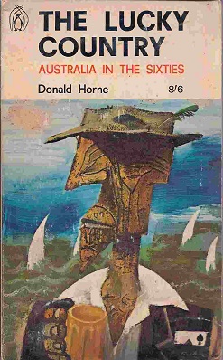
Funnily enough though (and quite apropos to this article), the term ‘lucky country’ (first popularised in a book of the same name by an Australian author, Donald Home, back in the 1960’s) was actually supposed to be negative:
“Among other things, it has been used in reference to Australia’s natural resources, weather, history, its early dependency of the British system, distance from problems elsewhere in the world, and other sorts of supposed prosperity.” (from Wikipedia)
So how do the States & Territories of Australia compare – both with each other, and on a global stage? Well, to paraphrase George Orwell’s Animal Farm, some States and Territories are luckier than others. But before we get on to the qualitative differences, lets start with the quantitative ones.
Here’s how things look on a State and Territory basis in absolute terms – i.e. not accounting for population differences. Note the term, GSP. That’s not a spelling mistake, it stands for ‘Gross State Product’ and is meant to be a similar measure as GDP, but for sub-national units.
We can see here how much the economy of Australia is dominated by NSW and Victoria, though this is due mainly to how populous they are compared to the other States (the two of them collectively make up around 60% of the total Australian population), as the next chart shows:
What the above two charts obscure is that while the economies of the 2 biggest States are relatively closely matched, things start to diverge a lot at the smaller end of town:
The above chart shows how GSP has changed over the last 20 years. You’ll note that, although all States & Territories (which I’ll just refer to as ‘States’ moving forward) are better off than they were in 1990, there hasn’t been a huge amount of ‘social mobility’.
The poorest States in 1990, Tasmania and South Australia, are also the poorest States in 2020. The wealthiest States in 1990, the Northern Territory, WA, and the ACT, are also the wealthiest in 2020 (though WA took the lead from NT in 1993 and has mostly held it ever since).
Here’s a static version of where things are at the moment, as per the latest ABS data:
What’s pretty staggering is the size of the difference between the ‘rich’ and the ‘poor’ States – TAS and SA have roughly half the GSP per capita of WA and NT. In Global terms, that’s a bit like the difference in GDP between Switzerland (2nd highest GDP per capita) and Belgium (16th highest GDP per capita).
The following chart shows where each State’s GSP comes from, broken down by industry / sector. Make sure you play around with the filter, as the default setting will show you an Australia-wide breakdown (you might need to scroll down on the dropdown to see TAS and ACT):
The single biggest contributor to Australian GDP is Mining – no surprises there. But take a look at how different things are on a State by State basis.
In NSW and Victoria, ‘Financial and Insurance services’ are the biggest contributors to GSP. In SA and Tasmania, it’s ‘Healthcare and Social Assistance’. In the ACT it’s ‘Public Administration and Safety’ – probably due mostly to lots of politician related expenditure.
Only in Queensland, WA, and NT is Mining the biggest industry, but particularly in the latter two States, it makes up a huge proportion of total GSP.
As the above charts show, NT and WA are especially dependent on mining, with close to a full 50% of the latter’s GSP coming from that industry.
In fact, if all the minerals and metals suddenly disappeared from WA overnight, it’d wake up with a GSP per capita of around $58,700, making it even poorer than Tasmania. WA is the luckiest state in the entire lucky country, it would seem (at least while the iron ore price stays high).
As a final bit of fun, here’s where some of the States & Territories would rank if they were sovereign nations. Let’s start with WA, since there actually is a secessionist movement in Western Australia – it even has its own Wikipedia page.
As you can see from the above table, Western Australia would be ranked the 46th largest economy in the world if it was its own country, beating out New Zealand, and only around 10% smaller than Bangladesh despite having less than 1/50th the population.
Next, narrowly beating out Perth in position 42, we have Queensland:
An impressive showing, with a GDP significantly larger than Bangladesh, Egypt, and Vietnam – all of which have between 18 and 30 times as many people.
Jumping up the ranks somewhat, we have Victoria in 33rd place:
Wealthier than Ireland, Denmark, and Singapore in absolute terms, (though somewhat poorer on a per capita basis) and nearly as wealthy as the most populous nation in Africa, Nigeria.
Finally, in 25th place we have New South Wales:
An economic powerhouse, wealthier on a per capita basis than all its neighbours (including, surprisingly, Sweden).
Sorry SA, NT, ACT, and Tasmania – it’s not that I don’t love you, I just ran out of time. Cue sob story: this is my part time hobby. I’d love to make it my part time job, and maybe even some day, my full time job.
If you enjoyed this article and would like to help me out, there are a few things you can do.
- I just created a Twitter account (I know, I know – bit late to the party). I promise to only post interesting things! Follow me here: https://twitter.com/LeaneJonathan
- If you have a spare couple of bucks, please consider joining my Patreon. As I said, I’d love to do this as a full time job, but at the moment I’d even settle for breaking even! I’ve set my Patreon up here: https://www.patreon.com/datamentary
- You could subscribe to my Youtube channel here: https://www.youtube.com/channel/UCiqE7AFojsc6U7fqmPt2Vdg
Youtube won’t let me monetise until I hit 2000 subscribers, so there’s still a looong way to go. - You could upvote this post on Reddit, share it on FB, etc… Really, any publicity I can get at this point would be a big help.
- And finally, if you have any requests for future topics or would like to collaborate on something, please leave a comment here and I’ll get in touch.